DavidBM wrote:
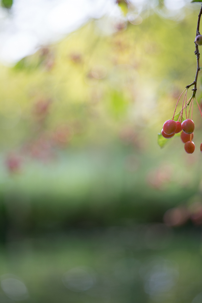
The sun goes down behind the Wattle in the Penrose forest.
Nice performance against the light from this CV!
This image (and the one you posted at the top of the previous page) perfectly illustrate the quality I most like from what I'm seeing from the CV65, what I'd describe as a kind of "transparency". In other words, the lens gets out of the way and allows the essence of the subject to be revealed.
genji wrote:
This image (and the one you posted at the top of the previous page) perfectly illustrate the quality I most like from what I'm seeing from the CV65, what I'd describe as a kind of "transparency". In other words, the lens gets out of the way and allows the essence of the subject to be revealed.
I know what you mean, and I wish I knew what it really was. Images from the CV seem to be brighter, even when they are not. They are somehow...lighter, or as you say transparent. I wonder if it is that the white OOF highlights really are white, because of the colour correction, and that's what causes the effect? Or is it something about the contrast curve: after the deep shadows the curve picks up quickly due to its cleanness?
I'm always a bit suspicious of inexplicable overall features ascribed to optics, but there's something going on here..
DavidBM wrote:
I know what you mean, and I wish I knew what it really was. Images from the CV seem to be brighter, even when they are not. They are somehow...lighter, or as you say transparent. I wonder if it is that the white OOF highlights really are white, because of the colour correction, and that's what causes the effect? Or is it something about the contrast curve: after the deep shadows the curve picks up quickly due to its cleanness?
I'm always a bit suspicious of inexplicable overall features ascribed to optics, but there's something going on here..
We frequently talk about the polarity between lenses that are "full of character" and lenses that are "too clinical". Somehow the CV65 manages to remove itself from that conversation all together, something I was trying to get at when I described the images it produces as transparent. At the risk of getting all metaphysical, when I wrote about its allowing the essence of the subject to be revealed, I had in mind the relationship between Zen Buddhism and art:
The Zen artist... tries to suggest by the simplest possible means the inherent nature of the aesthetic object. Anything may be painted, or expressed in poetry, and any sounds may become music. The job of the artist is to suggest the essence, the eternal qualities of the object, which is in itself a work of natural art before the artist arrives on the scene. In order to achieve this, the artist must fully understand the inner nature of the aesthetic object, its Buddha nature. This is the hard part. Technique, though important, is useless without it; and the actual execution of the art work may be startlingly spontaneous, once the artist has comprehended the essence of his subject....Show more →
Perhaps, through some weird alchemy, Mr Kobayashi and his team have designed a tool that facilitates this process.
genji wrote:
We frequently talk about the polarity between lenses that are "full of character" and lenses that are "too clinical".
I've never understood "too clinical"
I understand "full of character" - it's adorable aberrations that can really be nice.
But I've never found anything much in common between lenses people describe as "too clinical"
People say it about 1.8/55. Maybe it's just that its a lower contrast lens than many sharp ones, so it looks a bit flat until you boost contrast? But other "too clinical" lenses look different....
Are you a meditator gengi? I have been for many years (Dzogchen + Vipassana these days), and it is an essence of my photography in ways I try less and less to articulate. I've rewritten a lot of my artist's statements over the years, and I'm almost giving up trying to talk about that in them. I think many people can appreciate real zen art, but it takes a high level practitioner to make it. I'm not making real zen art, but practice is an influence.
I guess maybe when people say a lens is "too clinical" it's a shorthand for saying "the lens is accurate and has few flaws but I personally find the rendering un-pleasing." It is in a way trying to make a personal impression sound more objective.
And maybe "transparency" is simlar: saying, "this lens is accurate and with few flaws, but I find it pleasing."
When choosing lenses for my bag depending on my mood, the subject, where I'm planning to be, the light, I'll pick between lenses that are sharp and accurate vs lenses with character -- some wildness, dreaminess, also often full of flaws. This lens isn't wild, but it can be a bit dreamy -- less so than many. But at this point it's hard to imagine it not making the cut to go into the bag no matter what my mood or destination, unless I need to cut weight. I think if I had to write a full review of this lens I would be hard pressed to describe what it has that is "extra," beyond transparency.
My CV 35 1.7 is something like this too, and it goes in the bag whether I'm feeling zeissy or dreamy. When reviewing images and tagging the lenses, or looking through images, I can fairly reliably tell when it's the CV 35 1.7 by looking at a set of exposures made with through it. Like this 65, its main flaws are cats' eyes. Its bokeh is far less identifiable than this lens with its dodecahedrons. Stopped down, it is sharp and "transparent." But it has a character even without being a character lens.
Cosina Voigtlander has got something down with these lenses.
There is a horizontal line in the bottom bokeh area. It shows up in a few of these vertical bokeh series, but the horizontal ones don't seem to have it. This was 1/60 sec and I think with silent shutter. Just barely visible at this resolution, but quite clear at 1:1.
jlehet wrote:
There is a horizontal line in the bottom bokeh area. It shows up in a few of these vertical bokeh series, but the horizontal ones don't seem to have it. This was 1/60 sec and I think with silent shutter. Just barely visible at this resolution, but quite clear at 1:1.
I see the line but don't think it's the lens. It's probably caused by the silent shutter.
Thought that an important comparison for the 2/65 is the Leica 2.5/75 (the 2.4/75 is optically the same with the aperture blades adjusted mechanically)
The Leica is as sharp, I think. And it's much smaller. It doesn't have much LoCA in the strict sense.
But it has much more spherochromatism!
Here are two images of Annie, taken a long time apart (it seems her expression when concentrating on the ball is always the same)
And check the crops of the nose: that spehrochromatism in the OOF areas is super hard to correct, and it's almost completely absent in the CV 65. This is an amazing lens.
Having said that, at the whole image level it's not too disturbing on the Leica image, and it is small and sharp and lovely in many ways....
(oh and before someone points out the eye is just marginally sharper in the Leica image, this is not something I've been able to reproduce - they are equivalently sharp - it's just small difference in vibration or focus in this image)
@Phillip Reeve, your 55/1.8ZA's sample with the golden lady statue (and last comparison) shows how the 'green fringing' high contrast area behind the focal plane, blends with the foliage and gives the impression of smoother rendering with lower contrast...so not all color aberration is bad...(Although I still hate it. )
The first comparison is a great torture test and shows how amazing the CV 65 APO really is.
genji wrote:
We frequently talk about the polarity between lenses that are "full of character" and lenses that are "too clinical". Somehow the CV65 manages to remove itself from that conversation all together, something I was trying to get at when I described the images it produces as transparent. At the risk of getting all metaphysical, when I wrote about its allowing the essence of the subject to be revealed, I had in mind
Perhaps, through some weird alchemy, Mr Kobayashi and his team have designed a tool that facilitates this process.
That's what is often said about Otus lenses (i.e. transparent), with which I agree - they don't really add or subtract anything from a scene, but present it as it really is. Remember when I said that the CV 65 is Otus-like? I still think it is, and your description of it being transparent falls in line nicely with this...
Fred Miranda wrote:
@Phillip Reeve@, your 55/1.8ZA's sample with the golden lady statue (and last comparison) shows how the 'green fringing' high contrast area behind the focal plane, blends with the foliage and gives the impression of smoother rendering with lower contrast...so not all color aberration is bad...(Although I still hate it. )
The first comparison is a great torture test and shows how amazing the CV 65 APO really is.
Almost seems like the Voigtlander did not display all the magenta dye that must have been in that water fountain....😳
DavidBM wrote:
Thought that an important comparison for the 2/65 is the Leica 2.5/75 (the 2.4/75 is optically the same with the aperture blades adjusted mechanically)
The Leica is as sharp, I think. And it's much smaller. It doesn't have much LoCA in the strict sense.
But it has much more spherochromatism!
Here are two images of Annie, taken a long time apart (it seems her expression when concentrating on the ball is always the same)
And check the crops of the nose: that spehrochromatism in the OOF areas is super hard to correct, and it's almost completely absent in the CV 65. This is an amazing lens.
Having said that, at the whole image level it's not too disturbing on the Leica image, and it is small and sharp and lovely in many ways....
(oh and before someone points out the eye is just marginally sharper in the Leica image, this is not something I've been able to reproduce - they are equivalently sharp - it's just small difference in vibration or focus in this image)...Show more →
Thank you, David. The Leica did better than expected, even though it is a very nice lens, the CV seems to be a home run. Talking about the CV, mine arrived earlier today.
You guys should post large G.A.S. warnings or something like that on the first page of those threads .


 )
)
 .
.