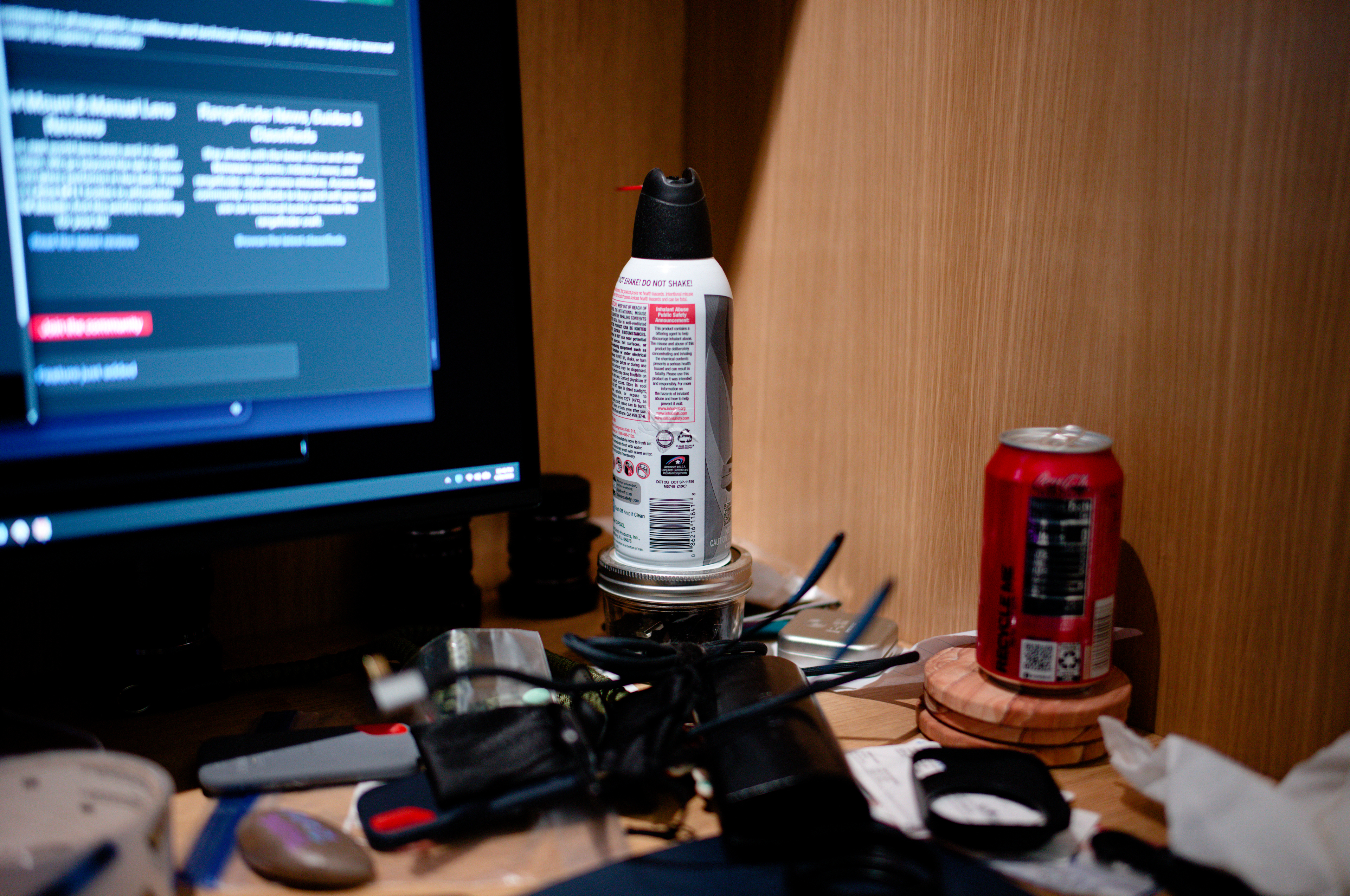
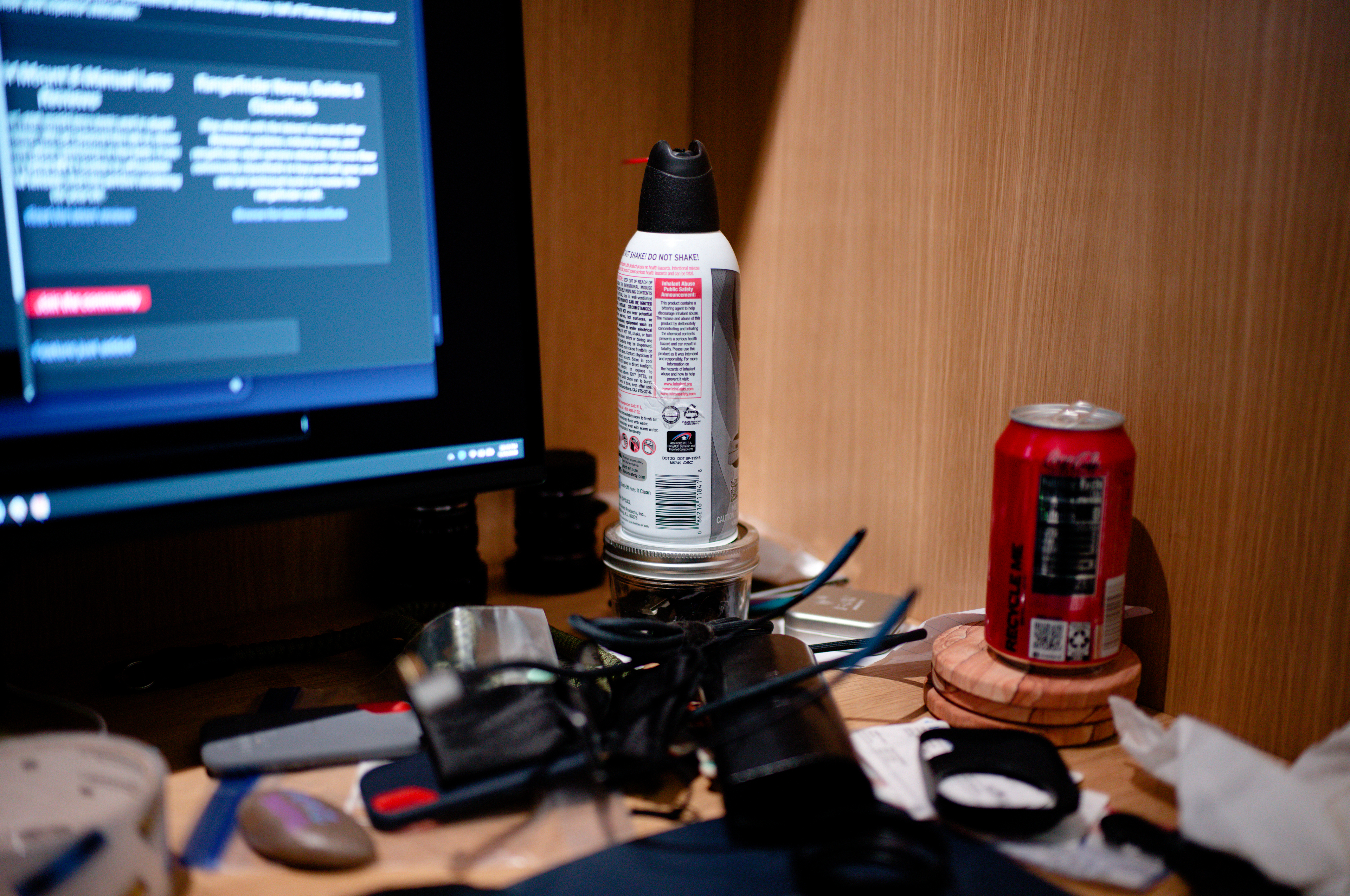
Ok, Mystery question. Even I am a bit baffled and undecided. Would like your opinion.
These two were taken one after the other with the same camera. Don't cheat and look at EXIF. The Files are exported to 4k Display size. Nothing fancy just a picture of my messy desk.
Focus point was the "DOT 2Q" text on the can.
Both images were shot at f1.4
Both are from a 35mm M mount lens
One lens is more than double the price of the other.
Both images were processed with DXO Photo Lab 9 and had Velvia 50 Preset from Filmpack applied.
Not looking for rocket science here. Just an honest opinion. Can you tell a difference between the two shots that would tell you leave one lens behind and take the other?
I cannot see a difference on my phone screen. But that is expected even with lenses with huge real differences in performance. Such things are usually seen on large high resolution screens and when printing.
yea. i have a 32 inch 4k display qd oled and its hard to tell them apart. Which in all honesty is a bit disappointing. But that's just me. want to read what others think.
Honest take? This isn't really demonstrating much beyond a cluttered desk. For a subject like this, even an iPhone would be overkill � never mind the lenses you're comparing.
The reds were more saturated on one of it, and looking at the can, one presented more micro contrast. Both will magnify when the file being push/pull. Ultimately I choose the one with more saturation.
RustyRus wrote:
Honest take? This isn't really demonstrating much beyond a cluttered desk. For a subject like this, even an iPhone would be overkill � never mind the lenses you're comparing.
It's not hard to see differences. The first image has gnarlier CA, especially visible in the DO NOT SHAKE of the central can (purple) and at the legalese at the very bottom of the can (green).
The 2nd image trends harder towards cats eye bokeh at the edges of the photo.
Overall, they are similar enough that it really wouldn't make a real world difference which to use...neither is impressive
Image one shows more contrast and faster fall-off.
Image two shows more SA, astigmatism and coma.
Hard to say if I prefer one over the other based on these images. Or, rather, both look good enough to make nice images (the differences here are not field relevant).
My guess is image one is the Zeiss 35/1.4 ZM and image two is the Voigt 35/1.4.
I will be honest - I scrolled back and forward about 10 times to find differences. But I did not. I didn't see the difference in purple either. If both photos were shown to me not knowing that 2 lenses were used, I would have thought the shutter was released twice one after another without lens change.
I like number 2. Has less color fringing and a slightly lighter color luminosity, along with some very slight and very lovely spherical aberration. Number 1 has decent colors, perhaps a bit less color luminosity, at least compared to 2, but has magenta color fringing in the out of focus highlights. Color temps not quite the same per image. Out of focus areas on both are pretty good, yet not the best.
Shot at f/1.4 ... curious how the acutance / aberrations (quid pro quo) change for each when shot stopped down. Does the gap narrow or widen when shot at say f/4?
That, and wondering how / if there are any focus shift issues when stopping down to say f/2 or f/2.8?
Imo, there are so many quid pro quo aspects to optics that a single image comparison may yield a false sense of equity, if you haven't found the achilles heel vs. sweet spots for each, and consider where they are optimized (near / portrait / distance), et al. At this distance, nervous bokeh, etc. may not appear the same way as it would for more distant scenes.
That said, I appreciate the point folks make when they suggest that "nearly the same" for "less money" ... just that other aspects should be understood / revealed. Of course, this is a great reason why we love Fred's reviews.
I like the second one better. I see more detail, more "sharpness" at your stated point of focus. I also see the red "Inhalant Abuse Public Safety Announcement" more distinctly, with a more-pleasing red, in the second image. These are my first impressions, without looking long or hard, or pixel-peeping.
Going back for a longer, second look, I think that I prefer the our-of-focus blur areas of the second image better, though I admit that my first, early impression may have caused some bias. The out-of-focus area on top of the cola can definitely looks better, to be, in the second image, which I do not think involved any bias. Again, no pixel pixel peeping.
Really, the red warning label is what decided the issue, during my first look. The top of the cola can affirmed my choice, during the second look.
I typed the above thoughts without having read on of the reply posts.
OK, now, having skimmed the reply posts, and then looking again, I am seeing the higher amount of magenta in the first image.
I am viewing this on a large Apple monitor, a disremembered model number, made a thousand years ago.