bijosn wrote:
the colors tend towards soft pastel like
With all due respect, that statement is utter nonsense. Look at the following direct comparison between the GM and the Nokton, and then show me where the Nokton has softer, more pastel-like colors. Look at the chrome, and you'll see the real problem with the Noktons; it's definitely not the colors.
Nifty Fifty wrote:
With all due respect, that statement is utter nonsense. Look at the following direct comparison between the GM and the Nokton, and then show me where the Nokton has softer, more pastel-like colors. Look at the chrome, and you'll see the real problem with the Noktons; it's definitely not the colors.
For better image quality, check out the photos on Flickr!
Thats a nokt 50 and not the 40 1.2 we are talking about, but even in the example you posted, the colors from the voigt tend towards more pastelish (look at the red car in the back and its blue rims) compared to the sony which is more vibrant and punchy.
Nifty Fifty wrote:
With all due respect, that statement is utter nonsense. Look at the following direct comparison between the GM and the Nokton, and then show me where the Nokton has softer, more pastel-like colors. Look at the chrome, and you'll see the real problem with the Noktons; it's definitely not the colors.
For better image quality, check out the photos on Flickr!
There is definitely a difference in color though, if they have the same white balance. The Nokton is less green, a tiny bit cooler and towards red.
--------
Edit: Regarding the Nokton 40/1.2 being "gentle", that is certainly true close to MFD. But it's razor sharp when focusing further away and stopping down a tad.
bijosn wrote:
Thats a nokt 50 and not the 40 1.2 we are talking about, but even in the example you posted, the colors from the voigt tend towards more pastelish (look at the red car in the back and its blue rims) compared to the sony which is more vibrant and punchy.
In my opinion, this is due to the higher contrast of the Sony, not because the colors are different. Incidentally, I personally usually prefer the Nokton to the GM in this regard. But of course, this can change depending on the subject and lighting.
Makten wrote:
There is definitely a difference in color though, if they have the same white balance. The Nokton is less green, a tiny bit cooler and towards red.
--------
Edit: Regarding the Nokton 40/1.2 being "gentle", that is certainly true close to MFD. But it's razor sharp when focusing further away and stopping down a tad.
I'm not familiar with the 40, but I can hardly imagine that its color rendering differs significantly from the 50, and the latter isn't cooler or less green than the GM. Ultimately, though, it's completely irrelevant to me what conclusions someone draws from studying Nokton images, and whether they then buy one or avoid it. I'm no on Voigtl�nder's payroll than I am on Thypoch's. Therefore, our different opinions can certainly coexist.
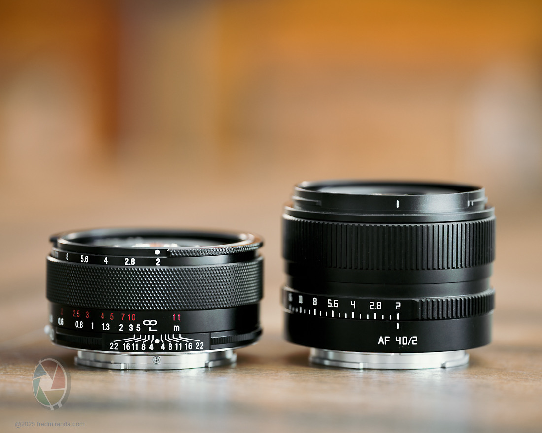
Neither of these 40mm f/2 lenses is designed for ultimate optical correction. Both use a relatively simple optical formula with a limited number of elements in order to keep the lenses as compact as possible while still delivering strong image quality. The tradeoff is that some imperfections remain, and those imperfections are part of what gives these lenses their distinctive rendering and character.
So what separates them? At first glance the differences may not be obvious, but photographers who pay attention to details will start to notice a few distinctions.
The Voigtlander 40mm f/2 Septon Aspherical delivers strong performance at the focal plane. The transition from focus to out of focus is not perfectly smooth and often shows some structure, with slight outlining around highlights. Starting around the mid-frame, specular highlights takes on a conical shape that resembles the rendering of many classic lenses from the past. The result is a lens that combines very good resolution and contrast without producing the overly smooth and abstract look that many modern lenses aim for. Personally I really enjoy lenses like this because they take advantage of high MP sensors while still producing images with real personality.
The TTArtisan follows a similar overall philosophy while adding AF, though it is physically larger. As mentioned earlier, it also shows a noticeable focus shift. Because of this, while the angle of view matches the Septon at infinity, it appears visibly wider at closer distances, as seen in the comparisons below. The rendering is somewhat structured and shows more visible double-line bokeh (nisen bokeh) in the out-of-focus areas. At normal viewing sizes, the two lenses can look quite similar, but a closer look at the out-of-focus areas reveals slightly less outlining with the TTArtisan. It also displays stronger vignetting at f/2 compared to the Septon at the same aperture.
Since the Voigtlander 40mm f/2 Septon Aspherical has lower optical vignetting, specular highlights tend to stay more rounded toward the edges of the frame. This is actually one of the easiest ways to tell the rendering of the two lenses apart.
Both lenses are well corrected for color errors. The Septon performs a bit better overall, although both lenses still show some green and magenta axial CA.
Overall the two lenses produce a broadly similar rendering. Some photographers might describe their draw as structured or even slightly nervous, but to me those qualities are exactly what give them their charm.
All images in this comparison received minimal post-processing, limited to sharpening, and were shot using the Adobe Standard profile.
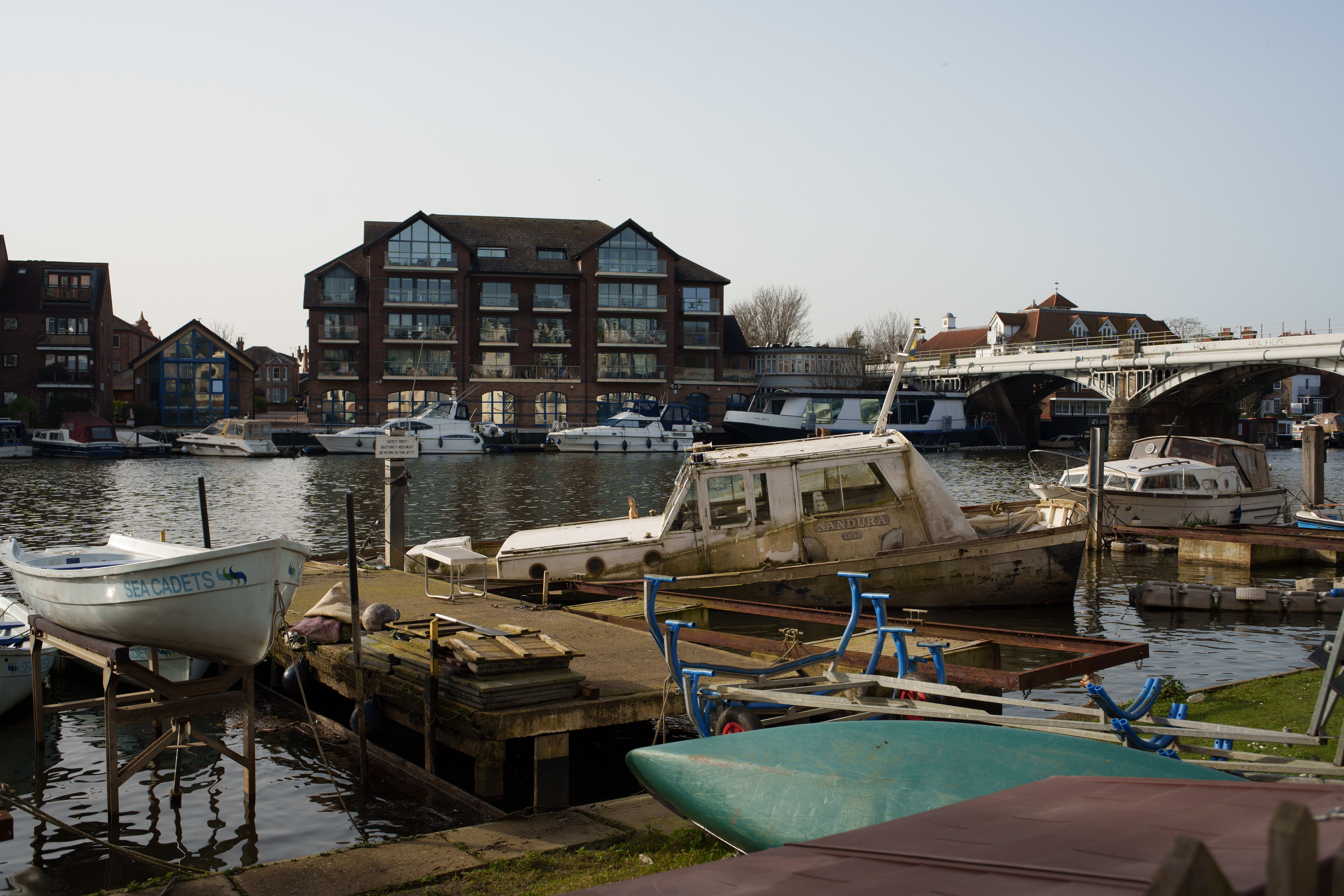
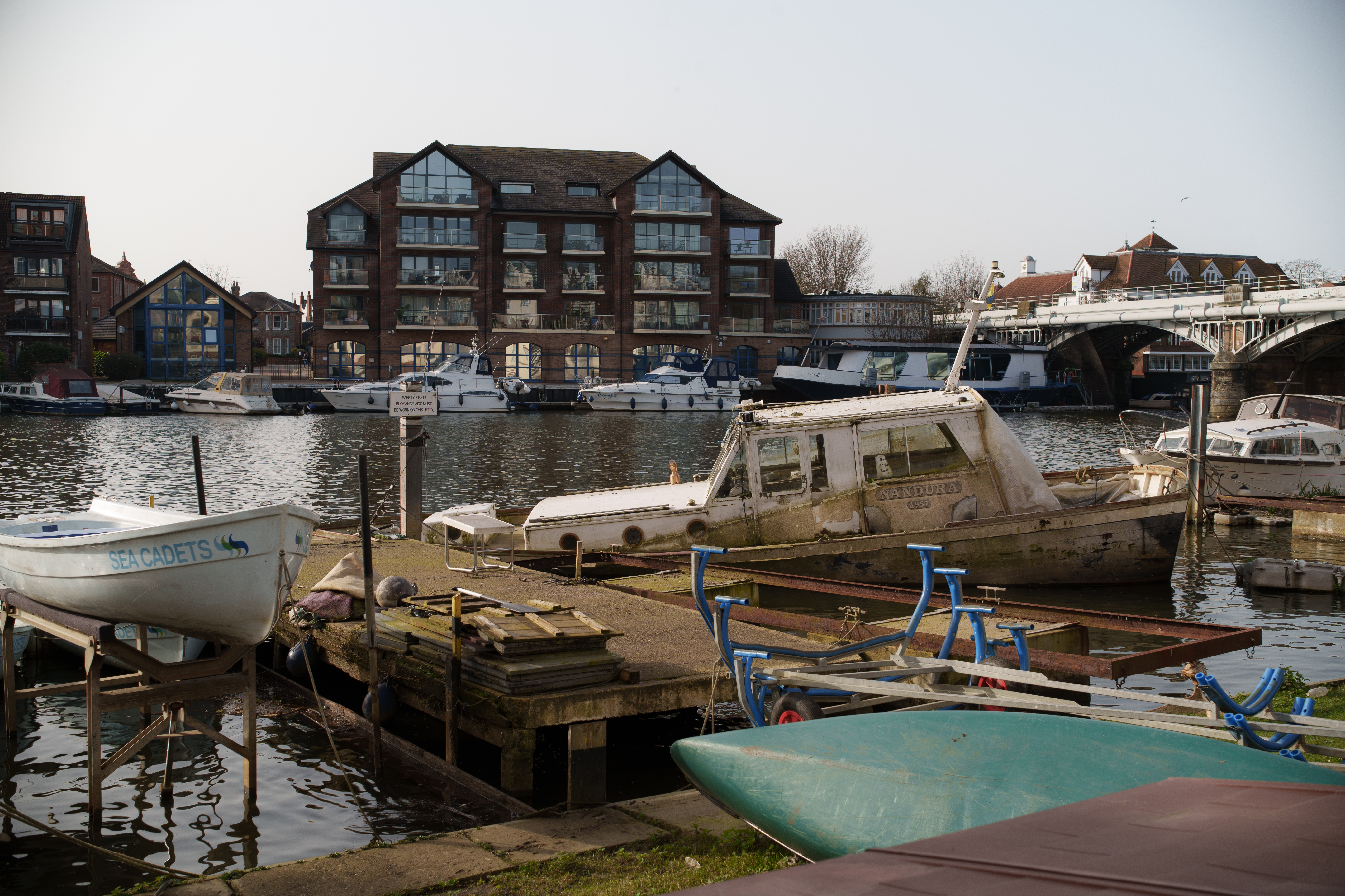
Here are some rendering comparisons at various distances.
Scene 1:
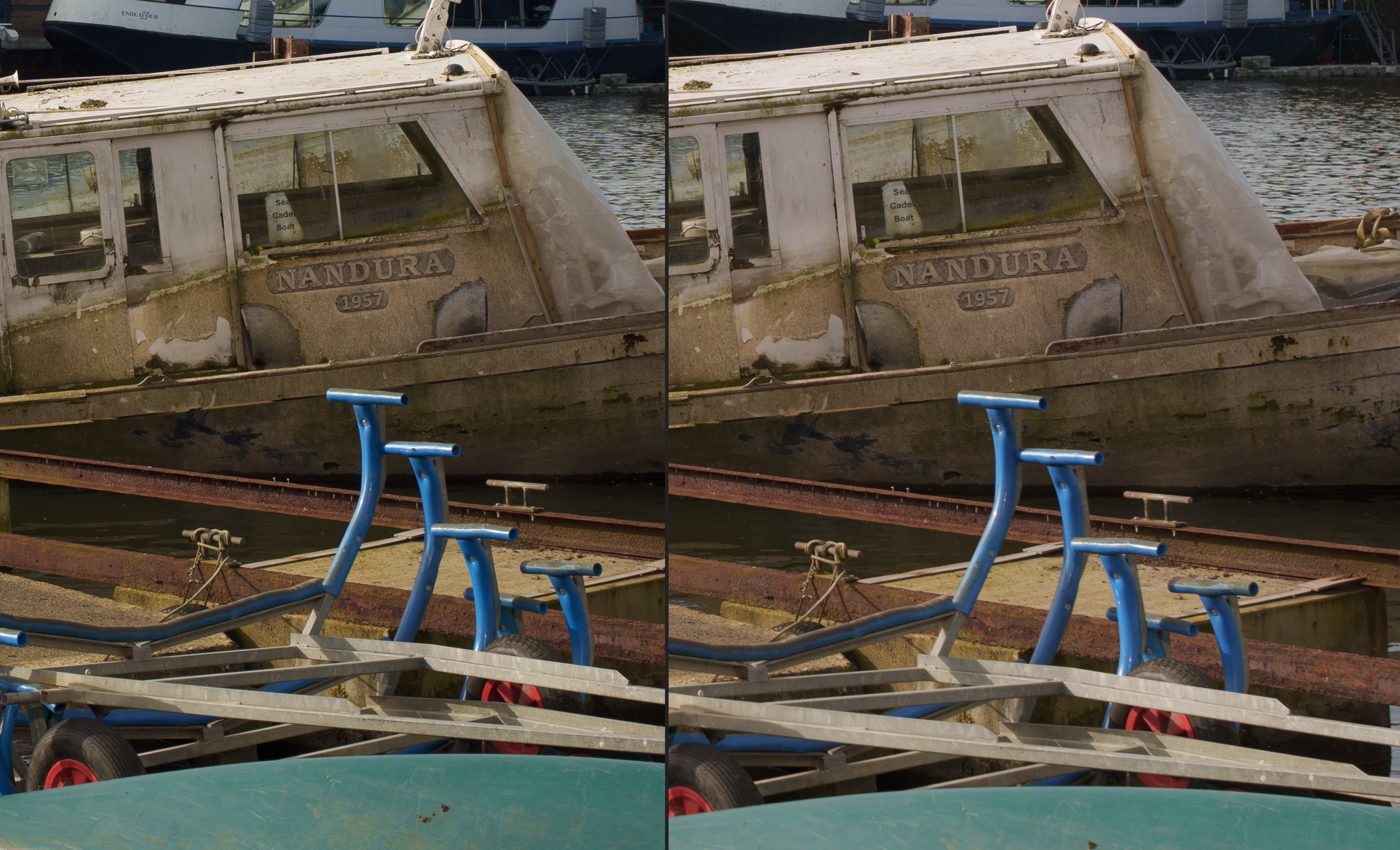
In this scene at around 2m, focus was placed on the car's right taillight. You will notice the slightly wider angle of view from the TTArtisan, along with some subtle differences in rendering when examining the image at higher magnification. Overall, the rendering is quite similar between the two lenses, showing a somewhat structured and characterful look.
100% magnification (Focused area).
The TTArtisan shows more fringing compared to the Septon.
The Septon has a similarly structured rendering, but with slightly more outlining and highlights that take on a more conical shape off-axis.
The TTArtisan shows more green fringing, and off-axis highlights take on a different shape compared to the Septon.
Subject focused at around 1.3m. Notice the slightly more structured rendering from the Septon and the different shape of the bokeh highlights off-axis between the two lenses. Also note the much wider angle of view from the TTArtisan, which at this distance behaves more like a 38mm lens due to focus breathing.
They are quite similar in terms of resolution and contrast at this distance. The Septon tends to have the advantage at longer distances.
The off-axis bokeh on the Septon is...something. You don't see those weird shapes until the far edges on the TTA in my experience, though they straight up turn into guitar picks instead of these oblong...things on the CV. This is also a good example of how much wider the TTA is in practice.
Same close distance as scene 2, around 1-1.5m. A closer look shows slightly more structure from the Septon, along with highlights that take on a more conical shape away from the center (off-axis). The TTArtisan 40/2 also shows a wider field of view and stronger vignetting.
Here are both lenses wide open and focused at infinity. This scene doesn't show much foreground rendering, but it gives a good sense of how each lens performs at infinity with real images rather than just the resolution tests already shown. As mentioned before, the TTArtisan matches the Septon's performance at close and mid distances, but it falls behind at infinity, likely due to field curvature.
At infinity focus, their angle of view becomes much closer, but the TTArtisan shows stronger vignetting. This scene also represents the worst-case scenario for both lenses in terms of vignetting.
In this section, right at the edge, their performance is quite similar.
At 1m, performance is similar, though the Septon shows slightly more contrast. The same observations apply as before: highlights take on a conical shape with the Septon, compared to a cat's-eye shape with the TTArtisan. There is also a bit more structure in the Voigtlander 40mm f/2 Septon image.
At 3-3.5m: One of the crops reveals more visible double-line bokeh on the TTArtisan, while the last image shows the foreground rendering, which is quite similar between the two lenses.
I take the TTA with friends and family casual outings for a little wider people pics with autofocus. It's nice enough. Sometimes when I use it for regular shots it looks good, sometimes I'm a bit dissappointed and expected a bit more.
I'm not sure I would appreciate that small of a form factor so would probably stick to the 40/1.2 SE, which isn't all that big really.
I am close to overpaying for the 35/1.4 classic nokton e-mount as well just to check it out after playing with some vintage lenses (constant dissappointment with trying to get good condition ones on eBay at the moment).
Worried the contrast is a bit higher with the 35/1.4 classic at f2.8+, where I plan to use it the most.
Bit weird as that's probably not why people pick that one up but the form factor looks good to me and there aren't a tonne of smaller 35s MF on Sony and I've been liking less "clarity" in the walkabout images.
I have the 40/2 nikon F mount that I also tried on Sony, and I don't know why but something really rubbed me the wrong way with the images but I know it's very popular and RoamingScott loves that lens so I'm not sure. Haven't tried it again since the vintage binge and didn't play with it a tonne so I'm hoping I get turned around on it. Mainly picked it up for film anyway.
Sometimes these smaller ones I feel look a little wrong with "off-axis". Like it's too unsharp where you expect it to be a little sharper or it's like not the smooth fade that you'd want but some jittery nervous astigmatism thing that is a bit grating.
Kind of like in Scene 1 with the car in the TTA pic, above the front-right wheel. Either be more in-focus like with the Septon, or have a smoother blur... Also shows up on the white garage door in the same picture, right side - better on the septon, though you know, neither are perfect for me.
AdaptedLenses wrote:
Thanks Fred. Now I need the TTA for up close AND the Septon for size and infinity.
I haven't seen a review of the TTA with as diverse a set of shots as mine...I don't find it lacking at any range if you shoot an appropriate aperture. IMO the ONLY consideration is...do you mind the TTA's guitar pick bokeh wide open. If you don't, it excels at basically everything for its size and price.
Yogifi wrote:
Kind of like in Scene 1 with the car in the TTA pic, towards the front-right wheel above the tyre. Either be more in-focus like with the Septon, or have a smoother blur... Also shows up on the white garage door in the same picture, right side.
You have to be a little judicious about using the TTA wide open, as it induces a bit of bloom (not unlike the 40/1.2 or Nikon Z 40/2) that softens up anything outside of center.
I also assume that based off my personal experience with TTA AF lenses, there's a significant amount of copy variation out there. I happen to have gotten a pretty good copy.
It is better stopped down for sure with scenes. I'm fine with it wide-open with people quite close, haven't tried it with people further away.
I did a medium-long range comparison the other day with the TTA 40/2 vs a cheap vintage 35mm (@ F8) and I was a tad dissappointed with the TTA.
Cheapo (& quite de-centered --- showing clearly off up until f8) vintage:
TTA:
TTA on the right:
Nit picky. It's a cheap lens, renders nice close with autofocus, good enough usually for walkabouts, great size.
But I could crop with the vintage lens and get a similar result - if not slightly better.
I've had some nice shots with the TTA of people closer quite reliable for a nice render (though not sony level af for sure), and this one on the same day at f11 with the a7cii: